Customise the look of the Pathfinder interface
Optimo Pathfinder add-ons are available to paying subscribers only
Additional charges may apply. For a quote, please Contact Optimo Financial
How it works
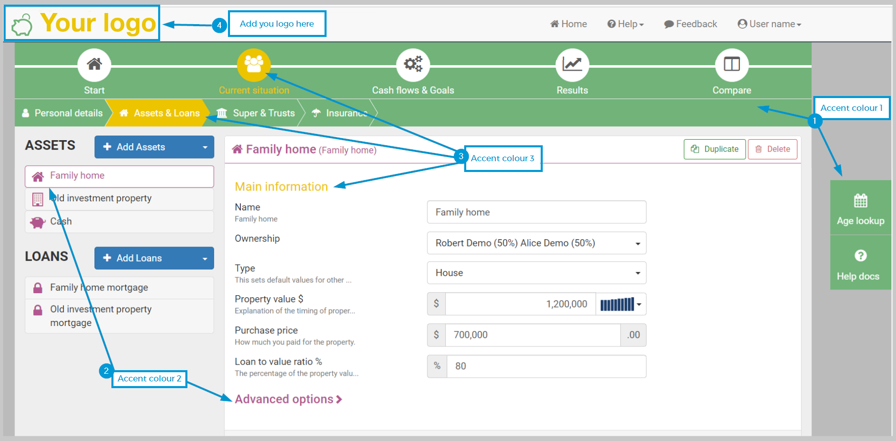
The look of the Optimo Pathfinder interface can be changed to match your organisation’s branding. This is particularly useful if you use Pathfinder in front of your clients. The specific changes you can make are:
Replace the Optimo Pathfinder logo with your logo
Set two or three colours to replace the default Pathfinder colours of dark grey, blue and orange.
Notes:
Everyone in your organisation with a Pathfinder login will see the same custom interface
For a custom logo:
Your logo will be visible only after you log in to Pathfinder.
The Optimo Pathfinder logo will still be visible on the login page, and in the footer of Pathfinder when you are logged in
For the custom colours, there are some colours that you cannot customise (e.g. blue buttons, duplicate/delete buttons, warnings)
It is only possible to change colours in the pre-defined accent groups (see below, for examples)
Examples of Custom Colour groups
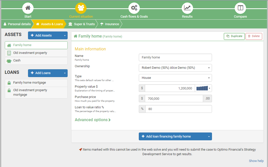
Example 1 - Three colours
This example maps the accents to three disctinct colours:
Green - accent 1
Purple - accent 2
Yellow - accent 3

Example 2 - Two colour groups (accents 1 and 2 are the same)
In this example, the accent groups are mapped to two colours:
Green for accent 1 and accent 2
Yellow for accent 3

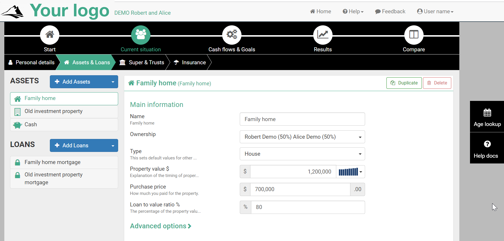
Example 3 - Two colour groups (accents 2 and 3 are the same)
In this example, the accent groups are mapped to two colours:
Black for accent 1 (i.e. the background of the top menu)
Teal for accent 2 and accent 3

Accent group details
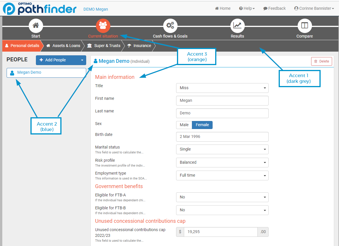
You can map the default orange, dark grey and blue (except for functional buttons) to different colours:

When choosing your colours, you can nominate up to three custom colours. Please note that the custom colours are applied in pre-defined groups and have a few guidlines:
Location | Guidelines | |
|---|---|---|
Accent 1 (dark grey in the default Pathfinder interface) | The background on the main top menu. |
|
Accent 2 (blue in the default Pathfinder interface) | Icons and headings at the 'Current situation' step. |
|
Accent 3 (orange in the default Pathfinder interface) |
|
|
How to request your logo and custom colours for the Pathfinder interface
Step 1: Nominate your custom colours
Please define the colours in RBG or hex codes.
Some options for defining your colours are:
Send us your style guide or branding guidelines | If you have an existing style guide or branding guidelines, you can send it to us, and we can make some samples for you to choose from. |
|---|---|
Tell us one signature colour | Tell us:
|
Define all the accent colours | We require three accent colours:
For more details and guidance, please see the ‘Accent examples’ and ‘Accent group details’ sections, above. |
Step 2 - Get your logo file
For best results, we prefer PNG format with a transparent background.
Please note that the logos with similar dimensions to the existing Pathfinder logo (i.e horizontal, rather than vertical or square) fit best.
If you have multiple logo versions, you can send us them all, and we can pick which one would fit best.
Step 3 - Send your request and approve your custom interface
Once you’ve chosen your colours and got your logo file, please email support@optimofinancial.com.au:
Your logo file
Your custom colours
We’ll give you a quote. Please note that we only offer custom logos and colours to users who have an active subscription.
Once you accept the quote, we will send you a mock-up for you to approve. This will take about one working week.
If you’d like to request changes, we’re happy to accommodate them
Once you’re happy with how it looks, we’ll make it available to you.
We can make some minor adjustments up to two weeks after it has been made available to you.
.png)